Indiana Collegiate Press Association Advertising Winners
| Rank | Newspaper | Points |
|---|---|---|
| 1st place | Indiana Daily Student Indiana University | 51 points |
| 2nd place | Indiana Statesman, Indiana State University | 8 points |
| 3rd place (tie) | The Observer, University of Notre Dame, Saint Mary's College and Holy Cross College | 2 points |
| 3rd place (tie) | The Reflector, University of Indianapolis | 2 points |
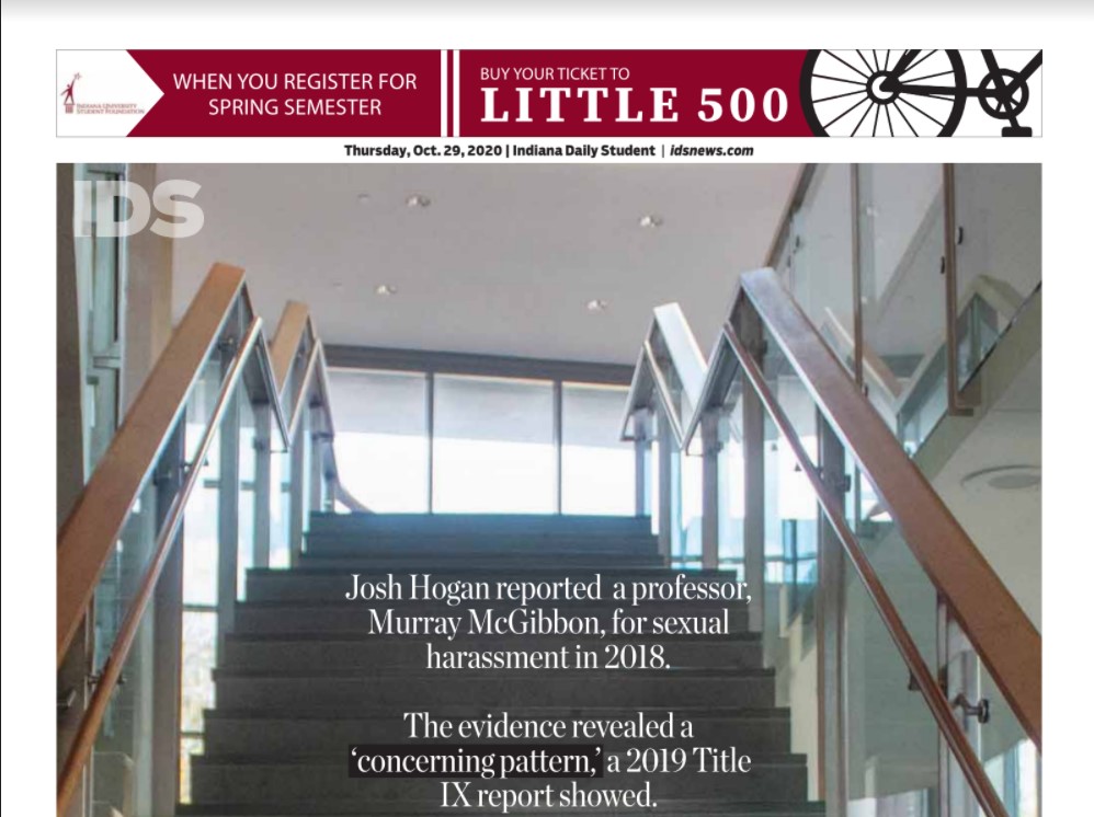
Best Ad Design in Special Section or Supplement
IDS Spotlight - Local News. Global Reach.
Judges' comments: “Simple concept executed very well.”
IDS General Readership - News for you, by you & about you
Judges' comments: “Fun and effective.”
Best Ad Layout
IDS Fall 2020 Housing Fair - Thank you
Judges' comments: “Good balance and use of space. Great "Thank you" ad!”
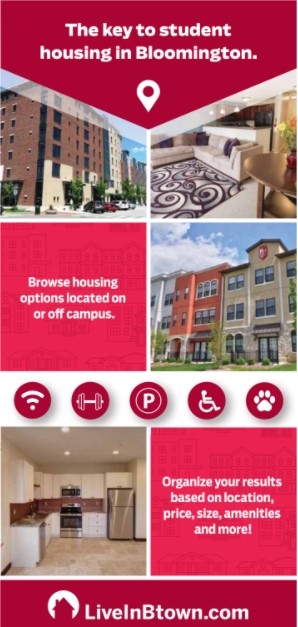
LiveInBtown - The key to student housing
Judges' comments: “Sleek, streamline design.”
Judges' comments: “Rich palette is eye-catching.”
Best Display Ad
Judges' comments: “Good info and to the point. You very simply told the reader what to do when.”
Judges' comments: “Very basic app ad done pretty well. Choose a dominant photo and copy edit a bit more. Good Balance.”
Judges' comments: “Simple and basic for what could be possible for the event you are promoting. There are great design and graphic possibilities here.”
Best Electronic Display Ad
IU LAMP - The new major that works for you
Judges' comments: “Clever lamp graphic.”
Judges' comments: “Very good ad and well built, but it is a bit slow. You have to watch for 19 seconds to get all the information.”
Best Electronic House Ad
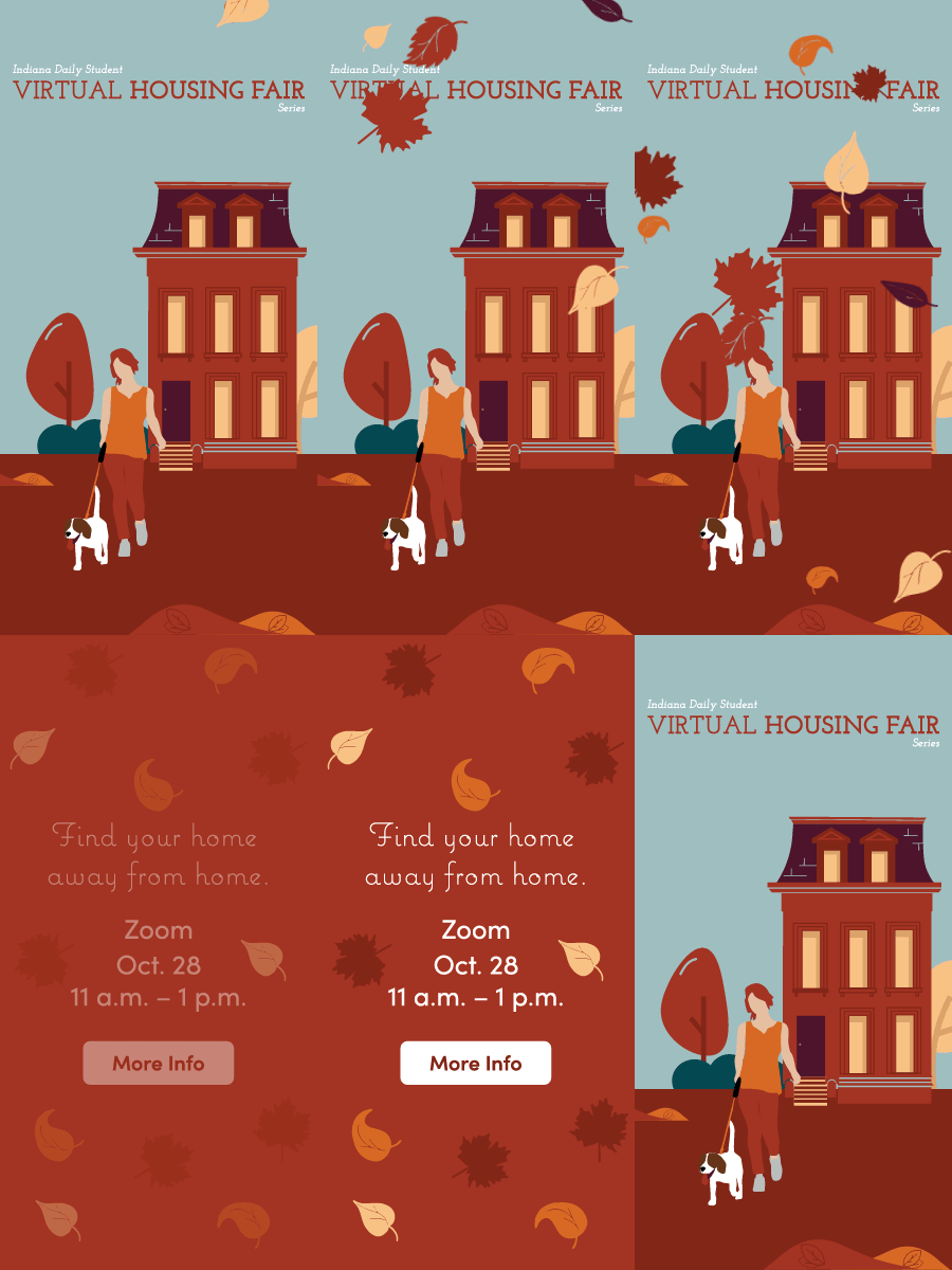
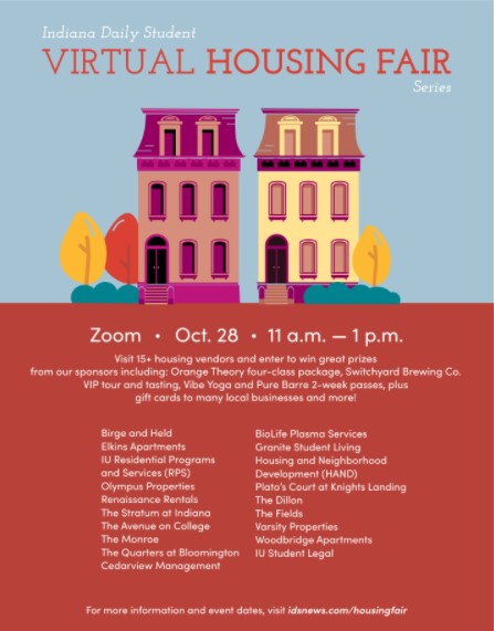
IDS Fall 2020 Housing Fair - Find your home away from home
Judges' comments: “LOVE! Appealing quick graphic and simple click through to where you want them to go.”
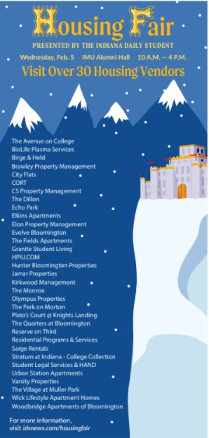
IDS Spring 2020 Housing Fair - Stop by tomorrow
Judges' comments: “Very cool ad! Quick graphics and I love the "find your castle" concept. Well done!”
Judges' comments: “Very simple ad design, but gets the point across well.”
Best General Media Kit/Marketing Package
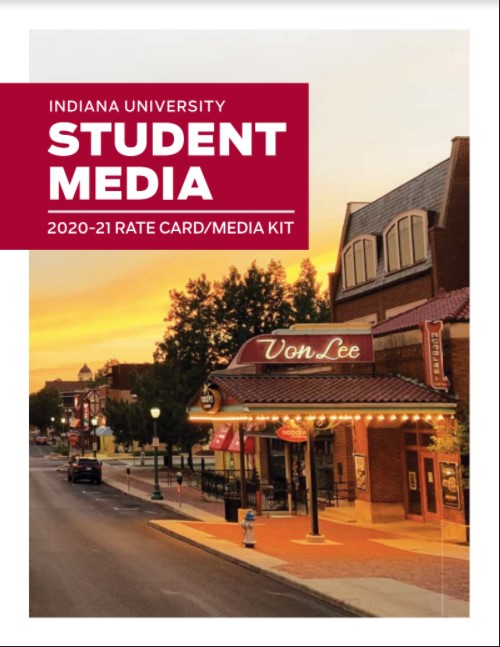
Judges' comments: “Excellent! You have great information on these but they might be a bit overwhelming to some clients, especially if they don't have a rep walking them through it all. Look for a few small things you can edit down. Ex: Put dimensions on the ad graphic instead of in a column with sizes and cost.”
The Reflector Media Kit (2020-21)
Judges' comments: “Excellent first four pages to this media kit. The design focus seems to waiver as you flip through. Even though we are just presenting online rates we still want it to be pleasing to look at. Implement more design and/or photo elements throughout.”
Judges' comments: “Good Work! This is really great info and good use of all the space. It does feel like everything is completeing to be domininate. Rank your elements by importance to the client and design from there.”
Best House Ad
IDS General Readership - News for you, by you & about you
Judges' comments: “Eye catching, effective use of space, very well done!”
IDS Spring 2020 Housing Fair - Slay your housing quest
Judges' comments: “Awesome theme. I would have reused "Find Your Castle" wording. Slay your quest copy is really good, but you could say what you needed to say in fewer words. The graphic design is your dominant element so take any chance to let that shine.”
Best Rate Card
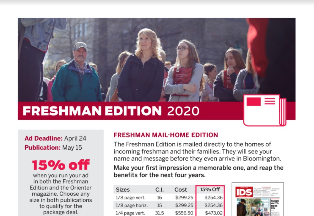
Judges' comments: “Excellent Rate Card! There is A LOT of information and pricing, but you have A LOT of products to include. This is a great problem to have. Look for small ways to edit the info down. Ex: Instead of including Winter/Summer discounts item by item, just say Rates are Discounted 25% in Winter and Summer. This example might not work for you, just a suggestion to cut down the pricing tables.”
Judges' comments: “Overall an effective rate card. Spacing and page breaks are a bit off. Think of the client reading through. Page breaks are the number one way to organize all this content. I would incorporate more of those beautiful black and white phtotos throughout.”
Judges' comments: “It appears this paper is printing, but I don't see any print rates in this rate card. It you are printing, also include distribution/circulation information.”
Best Self-Promotional Campaign (Three or more pieces)
IDS Spring 2020 Housing Fair - Slay your housing quest
Judges' comments: “Excellent campaign! Good use of graphics in various ways depending on the content presented.”
IDS Spotlight - Local News. Global Reach.
Judges' comments: “Good campaign with a solid headline! Maybe weave a design element, not just the headline, through each ad. The red doesn't really feel like it belongs as much as the other two.”
Best Use of Photography or Graphic Art
IDS Fall 2020 Housing Fair - Visit 15+ housing vendors
Judges' comments: “Terriffic graphic art! I would even give it a liitle more space in the ad.”
IDS Coloring Pages - Relax and color famous IU and Bloomington landmarks
Judges' comments: “Very cool ad and definitly gets the story arrcoss to the reader!”
Judges' comments: “Choose a dominate photo and design around it.”
Most Creative Use of Ad Copy
LiveInBtown - The key to student housing
Judges' comments: “Very concise use of verbs. The copy moves ther reader through the ad quite well!”
IDS Spring 2020 Housing Fair - Slay your housing quest
Judges' comments: “Very cool concept, could use a bit more for creative copy catagory.”


