Indiana Collegiate Press Association Yearbook Winners
| Rank | Yearbook | Points |
|---|---|---|
| 1st place | Arbutus, Indiana University | 38 points |
| 2nd place | Dome, University of Notre Dame, Saint Mary's College and Holy Cross College | 21 points |
| 3rd place | The Sycamore, Indiana State University | 12 points |
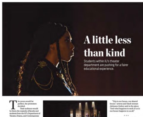
Best Academics Spread
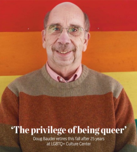
'The privilege of being queer'
Judges' comments: “Content is interesting and gives insight into the program and the faculty member. Sentences are short and paragraphs brief, featuring transitions that lead the reader smoothly from one paragraph to the next. The chunked paragraphs help keep the reader engaged. Storytelling quotes are used throughout the copy. Nice portrait of Bauder. It would have been a good opportunity to make the mini headlines of the chunked copy sections mimic the colors of the flag behind Bauder to tie the visual and verbal together.”
Professor tweets about 'women destroying academia'
Judges' comments: “The content ties in well to what is happening in 2020, and this is an important story to be told. Yearbook stories do not always have to be positive and surface level, so thank you for this. Editorializing is eliminated from the copy as well, which is important for these types of stories. I do wish more students were featured, but the writing is solid.”
Judges' comments: “Great use of specific examples in the copy. Try to avoid editorializing and vagueness i.e., "exciting projects" and "variety of majors." Give me exact facts and numbers because that information is available to you. Additionally, try to find what is interesting and unique for that year, not something that happens "every year." Missing proper formatting for quotes and transitions. Good use of candid photos for the spread but would like to see grade levels in captions.”
Best Album/Portrait Section
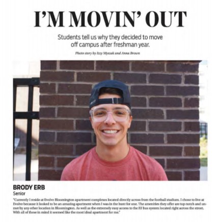
Judges' comments: “Nice creative feature of students moving off campus. I like that you included a photo of the students with the quotes but would have liked to see more variety in the images. Possibly the students in front of or inside the place they moved to off campus.”
Judges' comments: “Good detail shot of graduation on introduction spread. Good legacy quotes from students to tie to the theme. Would have liked to have all photos on this spread be in cap and gown, or all business professional for consistency.”
Judges' comments: “Would like to see more candid photos throughout this section. Try to keep head sizes consistent throughout the organization section.”
Best Cover
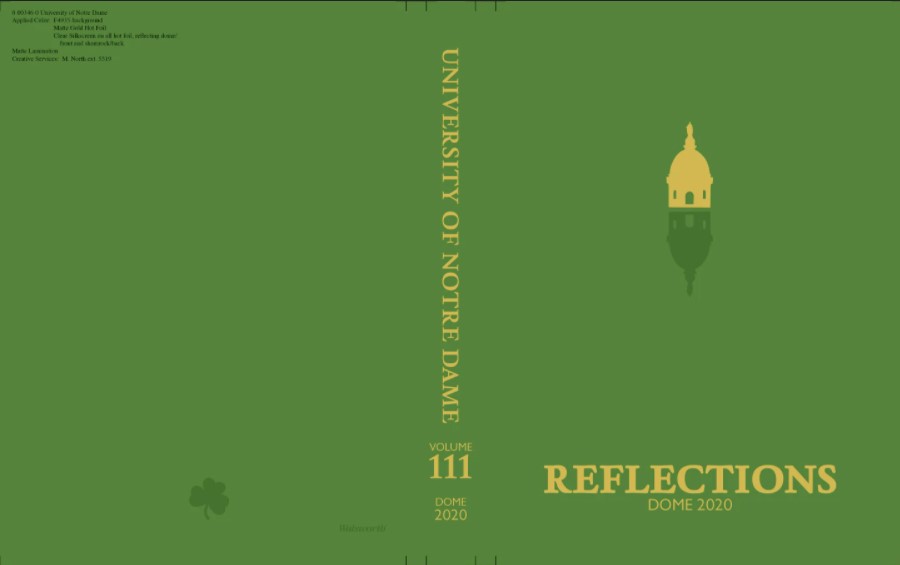
Judges' comments: “The details of this cover are very nice. Soft touch, foiling and spot gloss elevate the design and give a sense of luxury. Introduces the theme well and design elements of flipped imagery.”
Judges' comments: “The cover design remains consistent but has a new twist every year. It is an inventive concept to make something look and feel new while keeping the same elements on cover. Good texture and color.”
Judges' comments: “Less is more. The varying photo shapes, sizes, spacing, colors, and opacities distract the audience from the takeaway.”
Best Execution of Theme
Judges' comments: “Theme carried throughout cover, endsheets, title page, headlines, and alternative copy. Theme copy could be more relevant to the university and year. "We are constantly busy..." paragraph could be said for almost any student at any university for any year. Try to get more specifics in this copy to set it apart. I believe you chose a spot color for the design, and I would suggest using colors with the same vibrance for a more cohesive design. Try not to mix pastels with jewel tones and super saturated colors.”
Judges' comments: “Theme carried throughout cover, title page, divisions, and pages. I would have liked to see more specific theme copy to tie in legacy. Inside pages do mirror the cover concepts, but less color blocking templates would have helped the content stand out more.”
Best Feature Photography
Judges' comments: “Great color and emotion in these shots! Framing between hoop and triangle shapes make these images visually interesting and engaging. Composition is great but watch for cropping issues on the Dark Side Tribal dancer’s fingertips and the top of the Mrs. Kazooey’s head. Overall, this photo story is a very nice package that tells the story without copy.”
Judges' comments: “Great action in the dominant image. The audience can feel the movement and the dancing. Nice composition with the violin players. The hurdy-gurdy image is a bit dark. Watch for orientation of your images, both top images on the left page are tilted in an unnatural way. Only tilt images if you are trying to convey some movement happening. Neither of those images have movement, so the tilted orientation throws it off, especially because they are tilted in opposite directions.”
Judges' comments: “Nice action shots from this event. The content is creative and is a specific event tied to your university. However, if you are going to use multiple images from the same event, the angle and composition of each image needs to change. This spread would have felt stronger using 1-3 great images than including 6 images that all look and feel the same. Shoot low and shoot high, utilize objects around you for framing the scene.”
Best News Photography
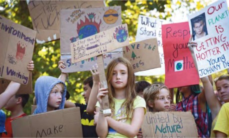
Judges' comments: “Great use of color in these images. The variety of storytelling shots make this a really compelling spread. The emotion was captured, and the cropping is great. The only thing that worries me is that the dominant features children, and that can be tricky without parental consent. To avoid this, try to feature IU students in your dominant photos.”
Judges' comments: “Even though this image is a little soft in terms of sharpness, the emotion makes up for it. A great image makes the reader want to jump to the caption to know more. What is being dumped on this poor person’s head? And why? And why does the person in the back look shocked? Cropping is a little close to the two heads, try to leave a bit more space. I would have liked to see the floor with this goo on it as well in a wide shot.”
Judges' comments: “Night photography is difficult for an array of reasons. The emotion is captured and the storytelling aspect is there. If you are only using one image on a spread, try to give it an interesting angle or framing.”
Best Organizations Spread
Judges' comments: “Great coverage for Dance Marathon. The photography is visually interesting and includes a variety of storytelling images. The copy is broken down by time frames which is interesting and helps move the reader through the story. Try to vary your transitions so the first sentence is not always ‘Grade name etc.’”
Judges' comments: “Image quality on bid night seems a bit soft, but the emotion makes up for it. The story is a bit generic and feels like any university could have written this any year. Write about what makes recruitment at IU different from any other university. Storytelling quotes are lacking, and watch out for missing spaces in the copy.”
Judges' comments: “Great dominant image. I do wish the photographer would have taken one step to the left to get the rest of the whole rifle in the image, but great flag movement captured. I do think the two members in front could have been identified in the caption. Good storytelling quotes in the copy. The story formatting needs work with proper LTQT.”
Best Overall Design
Judges' comments: “Visual ties to reflections drive the design concept and help keep the design consistent. The use of bars throughout the book and consistent photo editing tie pages together. Use of color is good but could be used more strategically. Pull quote has consistent design but the inconsistent spacing caused negative space issues.”
Judges' comments: “Very consistent design throughout the books. I would like to see more risks taken. Layouts are clean with minimal spacing issues. Typography was tasteful and paired well with the clean design. The book feels very unified, but not innovative in terms of design.”
Judges' comments: “It is great that you can carry out graphic elements throughout your designs. This helps unify the book and create consistency throughout pages. However, using a more subtle design element/approach would allow the copy and photography to shine. Including larger dominants would help with the feelings of being overwhelmed while taking in the content. Try to stay away from color blocking on every page.”
Best Special Section
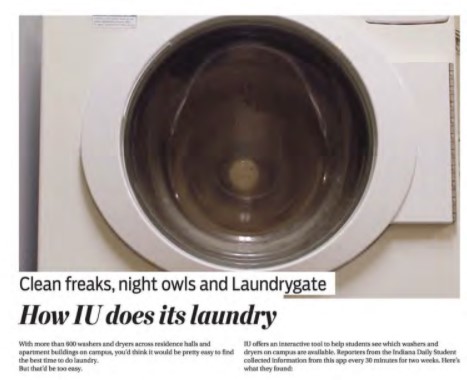
Clean freaks, night owls and Laundrygate
Judges' comments: “‘Laundrygate,’ the heatmap, and suspicious dryer use actually had me laughing out loud. The content of this special section is genius and always overlooked in yearbooks. Great use of infographics here that we never knew we needed.”
Judges' comments: “The homecoming history is good, but I am not sure what its purpose is. This was not an anniversary year, and it stops randomly in 1939. Moving forward, the coverage from the weekend is great and is very holistic of what it means for Indiana State University.”
Judges' comments: “Nice special soccer coverage that ties back to your university and connects your stadium. Try to avoid editorializing the story and stick to the facts.”
Best Sports Photography
Judges' comments: “Great decisive moment and emotion in the photo from this game. Muscles are tight and it is an intense moment. The player celebrating in the background is nice as well. In terms of composition, try to not crop out the leg on a wide shot, but of course that is easier said than done. This photo could be better if cropped closer to the left and top, to put in-focus player closer to left 1/3 since it's a little off-center right now. This edit will also make the player in the back more noticeable, which distracts from the cut leg.”
Judges' comments: “Nice team celebration shot. Cropping is nice and even though we can't see their faces, emotion and intensity are still captured. The players get a little muddled with the ball-carrier in the background. Despite thesse distractions, the moment is well-captured. I would suggest shooting a little wider so you have more room to crop if needed.”
Judges' comments: “Photos are all mostly leading off the page. To avoid this, try swapping the design. If you are going to include 6 photos from one event, make sure you are using a variety of wide, medium, and tight images on the spread — these are all wide. ”
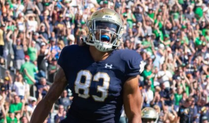
Best Sports Spread
Judges' comments: “Great story on Taliaferro. The ‘IU football players applaud the end ...’ photo is not as strong as the others in this package. Nice pull quote and packaging of spreads overall.”
Judges' comments: “Great action shot for the dominant image. Spacing on the spread overall is nice except for the trapped space between the dominant and the game’s score at the top and feels stair-steppy. The margins are a bit confusing as well. Would like to see jersey numbers incorporated in the captions and copy.”
Joey Brunk is learning a new system on a familiar floor
Judges' comments: “Nice profile and portrait of Brunk. The story does switch tenses at random, which takes the reader out of the story. Stick to past tense and try to avoid editorializing in the copy.”
Best Student Life Spread
Judges' comments: “Incredible story and accompanying images! Probably my favorite in this book.”
Judges' comments: “Nice variety of images and great dominant photo. Great coverage of an event specific to your university. Would like to see more paragraph structure in this story. Hard to tell what a quote or transition is. Try to avoid editorializing in the copy. ”
Judges' comments: “Nice photography, but the lack of a dominant image or element throws the spread off balance. It is also not very easy to read the copy on the salmon-colored bar. Nice quotes from Taylor as well that tie back to your university.”