Indiana Collegiate Press Association Newspaper Division 3 Winners
| Rank | Newspaper | Points |
|---|---|---|
| 1st place | The Record, Goshen College | 90 points |
| 2nd place | The Echo, Taylor University | 34 points |
| 3rd place | The Andersonian, Anderson University | 25 points |
Best Continuous Coverage of a Single Story
Judges' comments: “The most clear, well organized content in the category. Good pacing, sources, quotes.”
Judges' comments: “Nice timeline and how Covid affected your campus. Using consistent graphic is a service for readers — good job.”
Judges' comments: “Compelling information in the second half of article two in the series. This would be made stronger if sources were named. And because it was compelling, it would have been interesting to consider moving this information up. Could you have led with student responses on your campus to give it a more local feel? Facts/quotes are attributed to Aguirre. It would have been stronger to chase down those students he was speaking about and getting each to go on record.”
Best Entertainment Column
Judges' comments: “I can imagine a weekly Bachelor/Bachelorette recap being a popular feature on any campus. The topic is of interest to your readership.”
(The art of) dumpling-making: a Lunar New Year
Judges' comments: “After describing the ways to make dumplings, I'd segue right into the 8th paragraph and then introduced the ASA to improve the tempo. Overall, good job.”
Greta Lapp Klassen, private eye
Judges' comments: “This is a fun romp. I'd have condensed the D.A.R.E story and given more details about the actual process of finding and tracking down the mystery drug.”
Best Entertainment Story
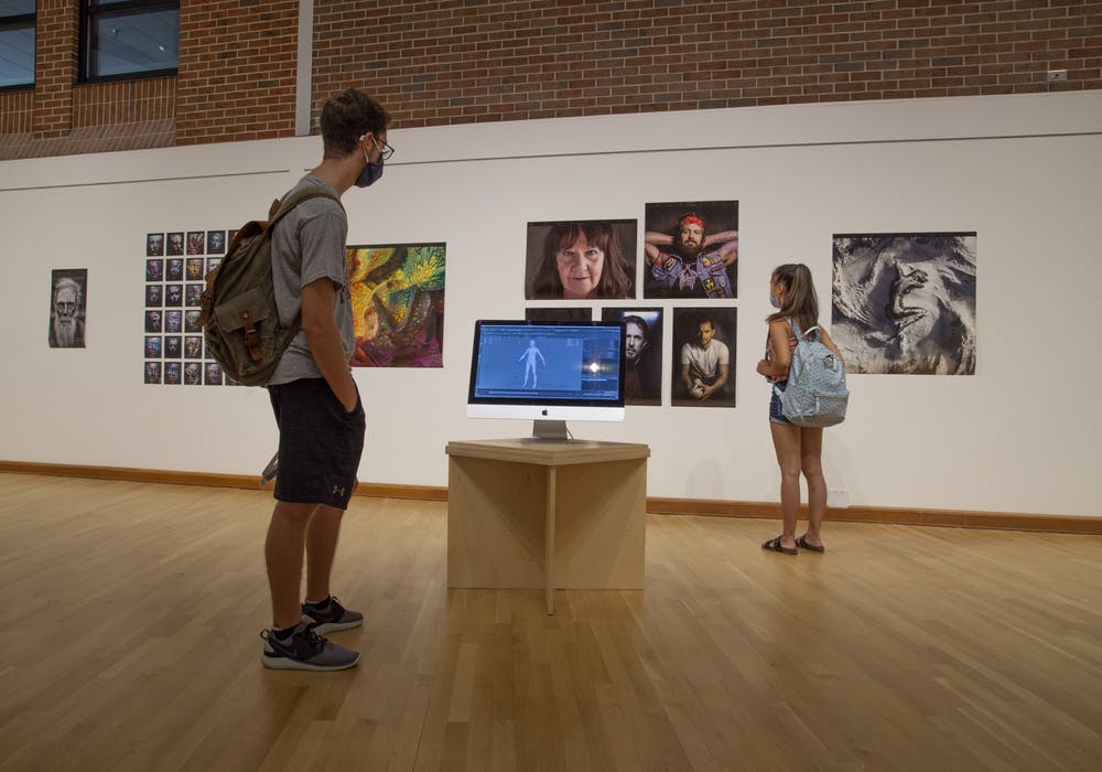
Ars Machina explores the world of CGI art
Judges' comments: “Really nice intro. I could see an article like this running in a large daily. Good job.”
The Wailin' Jennys return to Goshen
Judges' comments: “Exactly what I'd expect from a concert preview. It's nice that you remind the reader that this band has been to campus before. Good job.”
Henry G. Taygar: physics student turned writer
Judges' comments: “Features that highlight fellow students are always engaging for the reader. Tell me where to find the writer's books in your story. Provide a website or some entry point for the reader.”
Best Feature Story
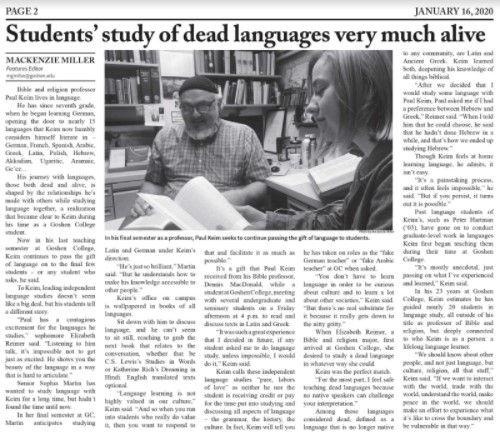
Students' study of dead languages very much alive
Judges' comments: “Enjoyable profile of an educator. The writing and quote choices express the depth of his knowledge and importance to the community.”
100 Years: Taylor's women in history
Judges' comments: “A fun look back in time and how history shapes the future. I would have moved up and made a little better connection between why women's studies, why Taylor, why now. The old rules were fun, but distracted from the purpose of the story. Next time, consider pulling them out into a sidebar that complements your body copy.”
North Manchester Unveils Mural on Main Street
Judges' comments: “Nice way to start the story. It's really effective when the words relate to the image. The process and artist intent would be more interesting as a feature story than how they cut through local government rules to make it happen.”
Best In-Depth Story
Student termination sparks controversy
Judges' comments: “Good organization of facts. Story is laced with background, quotes, and information that move the reader along with ease. This story is of high interest and concern to the paper's audience.”
Judges' comments: “Well organized and communicated. Information is handled with sensitivity. The impact of terminating a tenured professor has broad interest.”
Survey shows 96% of GC students are registered to vote
Judges' comments: “Hat tip for executing a survey and processing the results for your readers. It's not easy. A story like this becomes more relevant to readers when you bring some of those stats to life with their implications.”
Best News or Feature Series
Judges' comments: “This series does a really nice job of informing students about how a change in law will affect them locally. News is valuable when it's personal.”
Judges' comments: “Delightful diary entries. Fun approach. Good to include students, faculty, staff. I hope you continued with these. It will be an important time capsule in the near future.”
Judges' comments: “Relevant and timely. Good news value.”
Best News Story
Students Rapidly Move Out of Residence Halls, Relocate for Rest of Semester
Judges' comments: “Excellent use of quotes. They added a lot to your story. This piece localizes what students all over the world were experiencing. Good relevance.”
Judges' comments: “Nice. Good pacing, good quotes. Well organized. A campus-specific experience and response to a global event.”
First-year class boasts historical non-white majority
Judges' comments: “Great to see you how you built context around the numbers to make it easier for readers to digest.”
Best Opinion Column
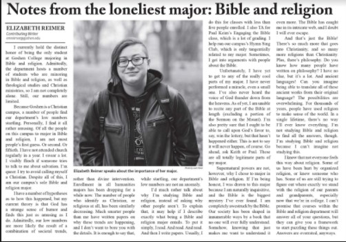
Notes from the loneliest major: Bible and religion
Judges' comments: “Very well written. It's personal, informative, clever, engaging. It did not have a clear call to action, but the writing makes that forgivable.”
Judges' comments: “Fast food for thought. It could be tightened up a little more in the beginning. If you wait too long to hook readers, they will move on. Your points and explanations have good strength of position and value.”
Regenerative agriculture: Don't blame the cows
Judges' comments: “Your position is clear and supported and newsworthy. The column has a nice closing.”
Best Review
Judges' comments: “This review has the strongest intro and closing. I like how you brought in a little bit about the artist's background. It was just enough to give it some depth.”
Crash Landing on You' smashes quarantine boredom
Judges' comments: “Great closing to the review. The details from the series you highlighted will help a reader decide if it's something they might enjoy.”
‘Tenet’ brings a unique twist to time travel movie trope
Judges' comments: “Your enthusiasm for this movie comes through.”
Best Sports Column
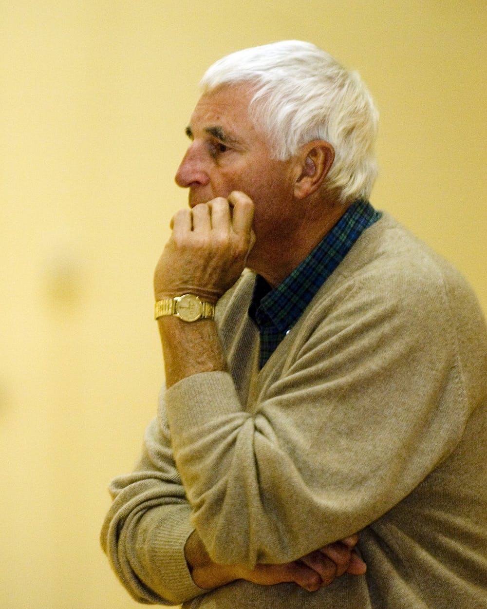
An unexpected reunion and legendary event
Judges' comments: “Good newsworthy relevance. Good history to explain the significance of Knight's return.”
The return of American and International sports
Judges' comments: “I like how you showed differences in countries and sports, and even differences between conferences within a sport.”
Black lives will always matter
Judges' comments: “This column is so valuable, and I would have ranked it higher if it had been about sports and not just written by a student athlete. You start to touch on this issue with sports near the end when you say people of privilege want to watch Black athletes for a couple of hours. Make that the focus of this column, and you've got a winner.”
Best Sports Feature Story
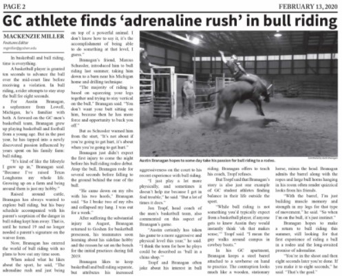
GC athlete finds 'adrenaline rush' in bull riding
Judges' comments: “Nice job finding parallels between sports to introduce this athlete's story. Strong hook. Good job spending time on both of the sports.”
Basketball star helps save lives
Judges' comments: “This is a compelling story. You can localize it more, bring it closer to your school community, by making the connection that these are student athletes more immediate.”
New Spartan Stadium Ready for First Events
Judges' comments: “Nice job. You can make dry stories like this more interesting by digging deeper for the student connection rather than just the administration's interest. Get more quotes, drill down, find out what football players or other athletes think about playing on turf, find out if the school might use it for non-athletic endeavors.”
Best Sports News Story
HCAC postpones all fall sports
Judges' comments: “Well organized. Of timely interest to readers. The layering of facts, supporting info and quotes help move the reader along with ease.”
Protocols and precautions abound for athletes
Judges' comments: “Nice rhythm. Quotes are informative and help move the piece along.”
Taylathon tradition continues again in 2020
Judges' comments: “Effective use of sources and quotes to tell the story of this campus tradition. Nice use of details to help paint the picture with words.”
Best Staff Editorial
How female professors experience discrimination
Judges' comments: “An interesting take on sexism. Good job localizing this topic by relating it to college professors and exploring attitudes and pay scale.”
Our View: Our Response Matters
Judges' comments: “The topic is relevant and of value. The use of language is clear and effective.”
Not guilty until proven guilty
Judges' comments: “A good reminder to be a good and fair American and human. This could be made more relevant by citing an injustice that's more recent than Richard Jewell.”
Best Feature Photo
Judges' comments: “As a feature photo, the black and white treatment of this photo creates a kind of vintage vibe. The composition is simple and creates a focal point with the people sitting in the foreground.”
Michelle Alexander Feature Photo
Judges' comments: “This is a great angle for a before-the-event shot, capturing a genuine moment between the three women.”
Best News Photo
Judges' comments: “The composition and angle of this photo make it more interesting. Keeping the people in the background in focus draws attention to their facial expressions, and draw the reader in to the story.”
New COVID-19 policies implemented on campus
Judges' comments: “This simple photo of a person's temperature being checked is a good indication of how daily routines changed due to COVID. The super-simple composition makes it feel ordinary, whic drives home the fact that it is new.”
Judges' comments: “This is a great moment in the speech, though with the background removed, a lot of the context is gone. Giving a sense of place to the reader, by showing the background, would add to the information in the photo.”
Best Photo Essay/Picture Story
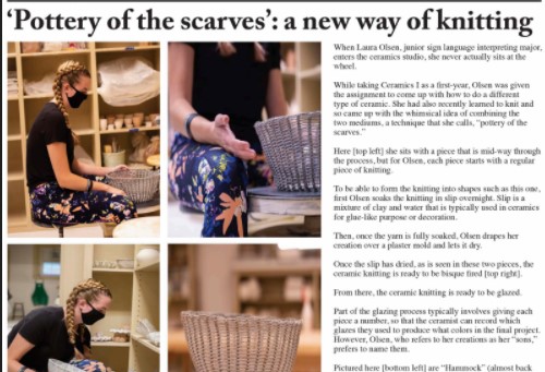
Pottery of the scarves': A new way of knitting
Judges' comments: “Keeping all of the photos the same size here really emphasizes the variety of angles and tightness in each shot. The four are specifically different, and work to show the pottery knitting process.”
Through my lens: A photographer's view of 2020
Judges' comments: “There is a good variety of photos here, though the top two are very similar. In this case, if one of fthe top photos was removed to make room for one much larger photo, the photo essay as a whole would have a better composition.”
Students perform in Disney-themed Encore
Judges' comments: “All of these photos are very well-shot, though they are all very similar angles and conetnt. Dropping in a few tighter shots, or people in different phases of the competition would add to the storytelling in the essay.”
Best Sports Photo
Women's Soccer Team Game Photo
Judges' comments: “The subject matter makes this shot great. Both teams lined up presumably before the game starts, with the referree between them. The extreme horizontal composition makes the photo more interesting, and draws the reader through the lineup.”
Tahj Curry Transition Dunk Photo
Judges' comments: “This is a great action shot, made even better with the expressions of the players on the bench – all fixated on the play at hand.”
Best Editorial Cartoon
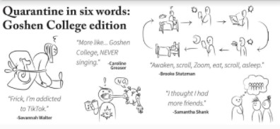
Quarantine in six words: Goshen College edition
Judges' comments: “The combination of man-on-the-street quotes with quick-hit illustrations makes for a really compelling way to tell this story.”
The ultimate guide to choosing your two friends
Judges' comments: “So funny, and using a flow chart is such a great way to illustratte this story.”
Best Front Page
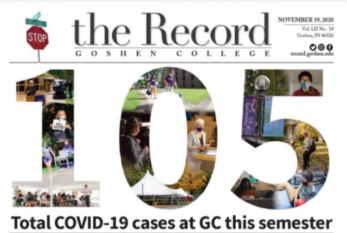
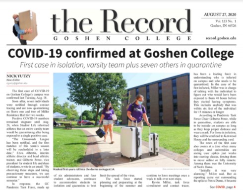
Judges' comments: “Using statistics as lead art on a front page can be tricky, and this page really brings it home. The "105" photo illustration is a compelling way to tell the story, and the supporting stats below are accessible and easily broken down for the reader. Additionally, the design elements and page design are clean. Nice work.”
Judges' comments: “The central photo really sends this page home. Additionally the Andersonian flag, page design elements and the grid are clean, consistent and well thought-out.”
Judges' comments: “While this page has the same clean design as the 11/19 page, the decision to place the statistics on this page over the photo makes them less legible and compelling to the reader. The survey photos at the bottom of the page are great – it's possible that switching the positions of these two stories, and pulling the statistics off of the photo would make for a stronger page.”
Best Illustration
Judges' comments: “Wow. This is an incredibly well-done illustration / poster to commemorate the passing of RBG. The design, quote, and execution (down to the cut-out marks) are all on point.”
Pandemic Logbooks Illustration
Judges' comments: “Including line illustrations to correspond with these diary snippets was a great choice, both for consistency and for adding personality and a twist to the page designs.”
Best Informational Graphic
COVID-19 By the Numbers Graphic
Judges' comments: “The "105" photo illustration is a compelling way to tell this story, and the photos involved are sized in such a way that the reader can tell what is going on in each to complete the story. The supporting statistics below the primary illustration add to the story, and are in a scale that adds to the story and illustration above.”
Judges' comments: “The content for this infographic is compelling and important to the reader, though the execution makes it less legible.”
Best Overall Design
Judges' comments: “This edition shows solid, consistent design throughout. The front page is well-conceived, page design elements are consistent, and photo and illustration choices are compelling and bring life to their related stories. Designers clearly make the most of each page.”
Judges' comments: “This photo story includes some killer images, and the design elements are clean. The angles are just about the same in each. Including tighter and wider shots would bring more interest to the page and work to tell more of the story.”
Best Pull-Out/Wrap Section
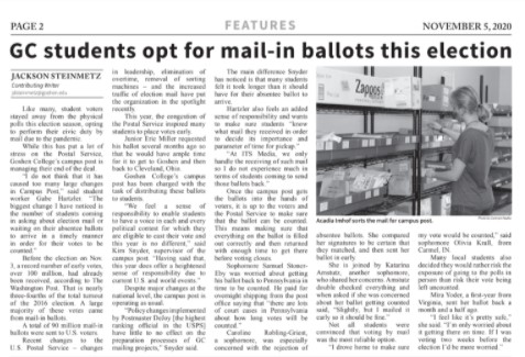
Judges' comments: “This is a comprehensive election section, with a variety of illustrations, graphs and photos that keep the reader going. There is a variety of perspectives weighing in on local and national elections, in a way that makes sense for your audience. Nice work.”
Best Single Issue
Judges' comments: “We are clearly going to keep talking about this issue, and that's fine. It has a compelling front page, wide variety of content that includes a calendar for surviving quarantine, a sports photo story and the Pandemic Logbooks feature. The design elements are consistent and clean, and a lot of thought has been put into the content for this edition.”
Judges' comments: “While the other submitted edition of the Andersonian has a more compelling primary photo on the front page, this edition has better photo choices and cleaner lines throughout.”
Best Feature Page
Judges' comments: “Very clean layout, the addition of the photo story really gives a lot of interest to these pages. The photos are all on-grid, and have varying POVs and sizes to keep the layout interesting.”
Judges' comments: “Nice design elements, with good font choices and a solid photo illustration as an anchor. There could be a bit more division above the story on the bottom, and around the headshots for Frank, Newton and Lugar, other than those details this is solid work.”
Judges' comments: “The illustrations on these pages bring a lot to the layout. Since the illustration on page three involves so much text in the background, it gets a bit lost with the text around it. Adding more space around it, or dropping it onto a white square background would really help it pop off the page.”
Best Special Section Front/Cover
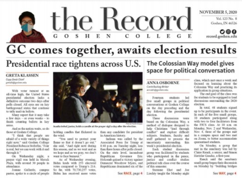
November 5 Election Front Cover
Judges' comments: “The top of this front page is well-balanced with the cutout image, compelling primary photo and covers an even mix of local and national politics issues.”
Election 2020 Special Report Cover
Judges' comments: “The profile illustrations at the top of this page are compelling because it is unexpected, and the story shows an international perspective on our presedential election. The rest of the page has a good variety of stories, and is a great lead-in to the section.”
Best Sports Page
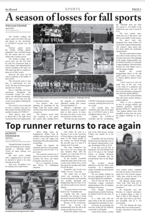
Judges' comments: “The photo story at the top of the section front is a great way to feature as many sports as possible. A great variety of shots are included, and the differrent crops make the layout interesting even in the small space. The photos selected for the running feature are good choices, and the design elements and grid are consistent throughout.”
Judges' comments: “The profile combined with game coverage and analysis makes for an interesting cover, and the calendar at the bottom adds a lot of value for the reader, and provides a visual anchor for the design. The design elements and overall page design are clean and consistent.”
Judges' comments: “This cover is not as compelling as the other submission from the Record, though the elements are still very consistent and the addition of the calendar at the bottom of the page is a nice addition.”

